
Big Space on a Little Couch
The framing of power

In my History of Photography course I’ll occasionally run into new connections between old familiar photographs. That happened again recently while talking about photography from the 1990s to the early 2000s.
Lectures in this course always begin with a historical contextualization. We acknowledge the major historical events that happen during the time line we’re exploring, then move on to a handful of photographers and their most significant works. This past week photographers Annie Leibovitz and Thomas Struth were on opposite ends of my lecture deck.
We started with Leibovitz and toured through a photograph she made earlier in her career of Leo DiCap (as I refer to him), and then moved into the presidential family portrait of the Obama’s from 2009. Leibovitz, an industry icon, was not a surprising choice for the Obama family’s first official White House portrait. She’s known for her beautifully lit portraits of the culturally famous and powerful. This portrait of the Obama family is no exception.
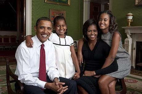
Except it was heavily criticized when it was released for being too casual and not representative of the power and dignity of the office. Obama’s lack of coat, and the casual interaction between the family members, were points of contention. However, this is the entire point of this portrait. Leibovitz and the Obamas (and I’m sure his entire team) collaborated to create a portrait of the first family that felt accessible. In the context of his campaign Obama ran on the messaging of hope and change. It should be no surprise then that the optics coming from his presidential office would follow suit — the photographs released would also look and feel different from earlier administrations.
In creating the casual family portrait, despite being made in the Green Room at the White House, Leibovitz tightly cropped out much of the stately room. The focus, and messaging, are clear: the Obama family is like any other American family. Accessible.
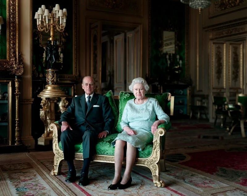
As my lecture carried on I told the students to keep the Obama portrait in the back of their mind. Several slides later we came upon Thomas Struth, a photographer known for his images of sweeping spaces. Perhaps a bit oddly, Struth was selected as the photographer for a royal family session in 2011.
Keeping the historical context in mind, we discussed first how this portrait felt. Students used words like: wealthy, distant, cold, filled with shadows. Yes, correct. All excellent observations. Then we discussed why they felt those things.
I first addressed Struth’s choice with the royal family to position Queen Elizabeth slightly forward into the foreground establishing her position of power. The lighting also heavily favors her, and at the same time casts her husband of over 60-years in to a fairly deep shadow slightly behind her.
Color also plays an important role in the photograph. Prince Philip’s dark suit further de-centers him in the photograph, where Queen Elizabeth’s light teal dress sets her in a kind of highlight that reflects the studio strobes used on the viewer’s left.
Unlike the Leibovitz portrait of the Obamas, there’s no attempt to minimize the wealth of the royal family. Struth is not attempting in any way to make the Queen appear accessible. Nice enough, maybe, but not like you and me.
Finally, the space between the Queen and her husband feels a mile wide on a very tiny gold gilded love seat. Compared with the Obama family who are draped over and touching one another. One portrait shows a family connected. The other, a cold distance.
After, we summarized differences in photographic approach, what the desired messages were by all involved, and again how the students (now armed with some understanding) felt about each. Students expressed a spectrum of feelings and opinions from stable to familiar and lots in between.
So I left them with a final question. I’ll do the same for you: If our current American presidential family were to have a family portrait made today, which do you think it would more closely resemble? And why?
Ooooo, good question my Friend!